A friend of mine, launching a new food product line, has developed a logo with his picture (a sketch) on it. He asked what I thought. My first reaction was no way - for an assortment of reasons, not the least of which is that pictures on packages are too small usually to accurately resemble anyone. Second, the photos/sketches are often schmushed or creased or stained due to handling along the distribution lines. Third, I really don't want to know that much about the person that made my food; for instance, I don't like the bare-chested guy on the Hawiian potato chips.
I walked through Albertson's and looked for the labels with people/faces on them. There are more than I remembered.
Kentucky Kernel, an obvious rip-off of Colonel Sanders, is sort of funny, but personally I don't like funny with my food. Except in recipe books.
Sylvia, Queen of Soul Food, intrigues me. After looking up her website and reading about her accomplishments, I'm so impressed I would try her products. In this case, the personalization did a great job.
The generic female and to a lesser extent, male figures, on the Italian food, seem harmless and do evoke a feeling of family, hearth, warmth and sincerity. It seems to work to create a hand-made feeling.

What possessed these people to use this logo and name? There is a story involved (I did look up the website) but I don't think it helps to sell the product.
And the Bragg's, Paul and Patricia, N.D., Ph.D. have their photos on all their products and are supposed to add credulity, I guess, to their Liquid Aminos. The labels are crammed with information about how to buy other Bragg products. Right or wrong, based on the way the label looks (kind of pharmeceutical), I pass on by.
Rufus Teague's photo doesn't do anything for me, but I like the copy.
This type of packaging is supposed to be aimed for the millennial market. It looks to me like it should contain valium or Xanax. The faces are over-excited and agitated looking. After all, it's only soup.
I like Wolfgang and worked with him on a couple of things. I don't think it enhances the image of soup to have his face and signature on the cans in this layout. The art director must have been ill the day they finalized the label.
The "made-up" people, icons, whatever they are currently called are harmless but I don't think they do a whole lot to sell product, well...maybe Little Debbie does.
Reynaldo looks like a matador or??? I'm not sure why he adds anything to the quality perception of Tapioca Pudding. Rosarita or the Cholula lady might be more appropriate.
Guy Fieri has a devilish look about him. Do you think his face sells barbecue sauce?
Mr. Stubbs doesn't look so hot on these labels either. Why should I buy Bar-B-Q Sauce from a black cowboy?
Uncle Ben has stood the test of time. I don't care that it no longer makes sense to have a black butler on a rice box. It has been condemned as racist by many groups over the years.
I suppose this is racist too.
The Newman products are fun and I like the way his image is ethnicized for each package.
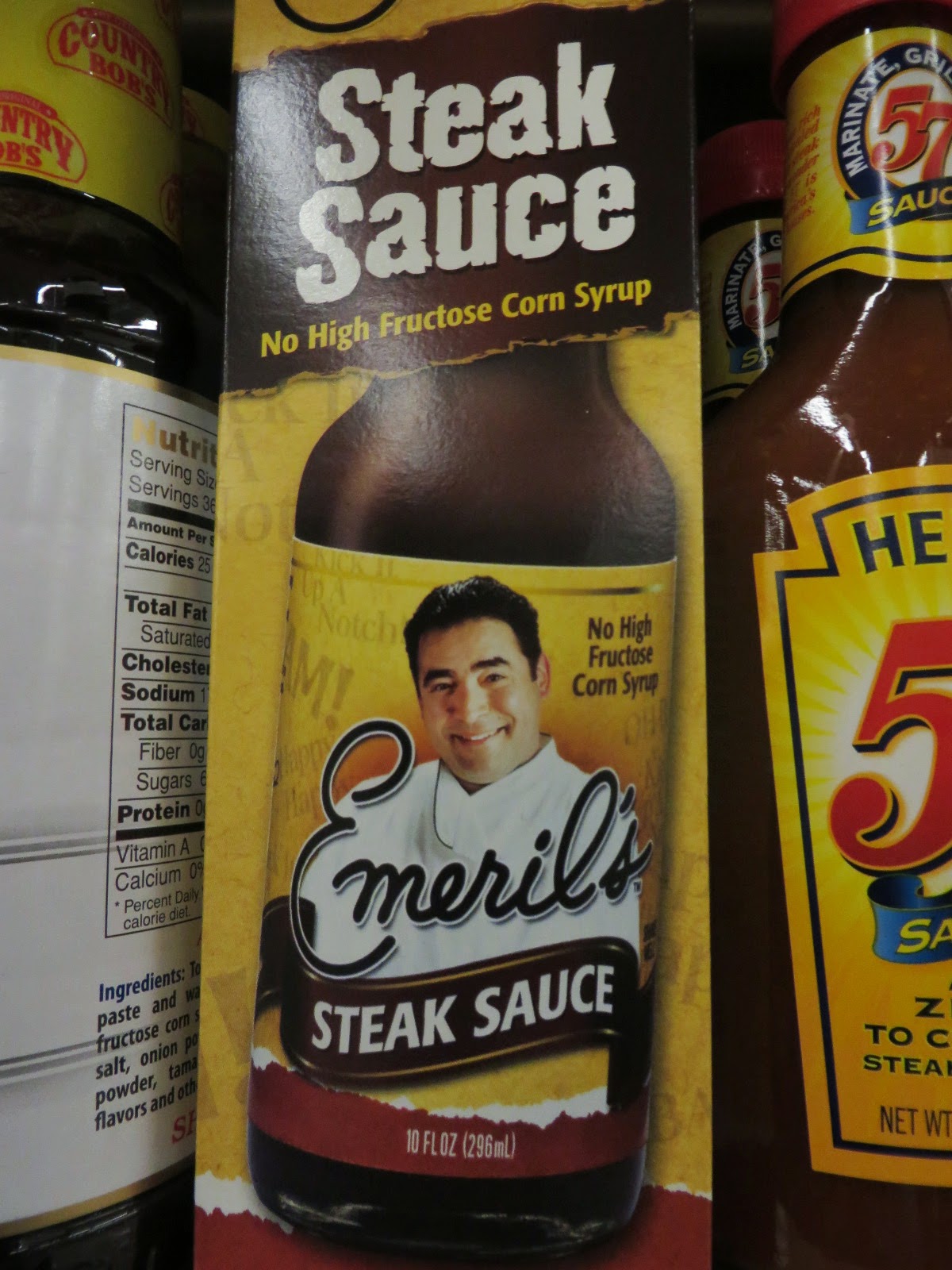
Emeril's imprimatur has value and for some reason he doesn't look bad on spaghetti sauce. The label is tasteful and his image was incorporated nicely - not just slapped onto it like the Puck packages.
The Arnold Palmer tea gets my vote for the worst of the lot.
I don't know who Aidell is...the sausage isn't bad, but I purchased it because of the varieties and the name and photo had nothing to do with my choice.
After my small survey, I'm sticking with my advice - no likeness. Just a simple, but memorable logo which will work on small packages and large packages, cookbooks and online. Something you can stick with, no matter what. All photo logos are dated.
Lawry's has one of the best logos I've ever seen. Recently it was changed slightly to make it a 3D sort of effect, but the essence of it has endured for over 50 years. Saul Bass was the designer - most of his designs have lasted for decades. Check out his track record here.
 |
| Saul Bass design. 54 years + |
 |
| Saul Bass design. 1953 |
 |
| Saul Bass design. 1993. |
 |
| Girl Scouts. 1978. |
As I scoured the shelves looking at labels I was surprised to find this Tabasco product. I worked on a prototype for this mayonnaise for the West Coast Group 25 years ago and I didn't realize it had mainstreamed. Over the years, the Tabasco family has fiddled a bit with the logo but not much - the essence of it is unchanged.
 |
| A vintage TABASCO label....hasn't changed much. |
And saving the best for last....I guess the Francisco's couldn't decide who should be on the label so they included everyone!
 What does breaking bad mean?


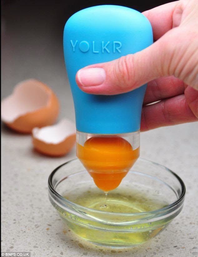
 Here's a new egg separator which acts like a pipette and sucks the yolk out of the egg. It's called the YOLKR.


